hack the north
Redefining the hackathon space

Every year Hack the North aims to put on the best hackathons in the industry. Attendees see this most during event weekend, but their interactions with Hack the North start months earlier with our branding launch.
Part of our commitment to quality is to launch new branding every single year. We have general principles for our illustrations and branding:
- Be a trendsetter, not a follower
- Prioritize inclusivity and diversity
- Push for quality and originality in every piece we create
2022 marked the first in person event in more than 2 years! To mark this point, we wanted to break out of the pastel colors and fantastical settings that have been saturating the hackathon space recently.
Going dark...

We decided to go with a dark theme to push ourselves creatively and set ourselves out of the crowd. This was easier said than done, since dark backgrounds with gradients and a sans-serif font now define every standard TechBro™ website:
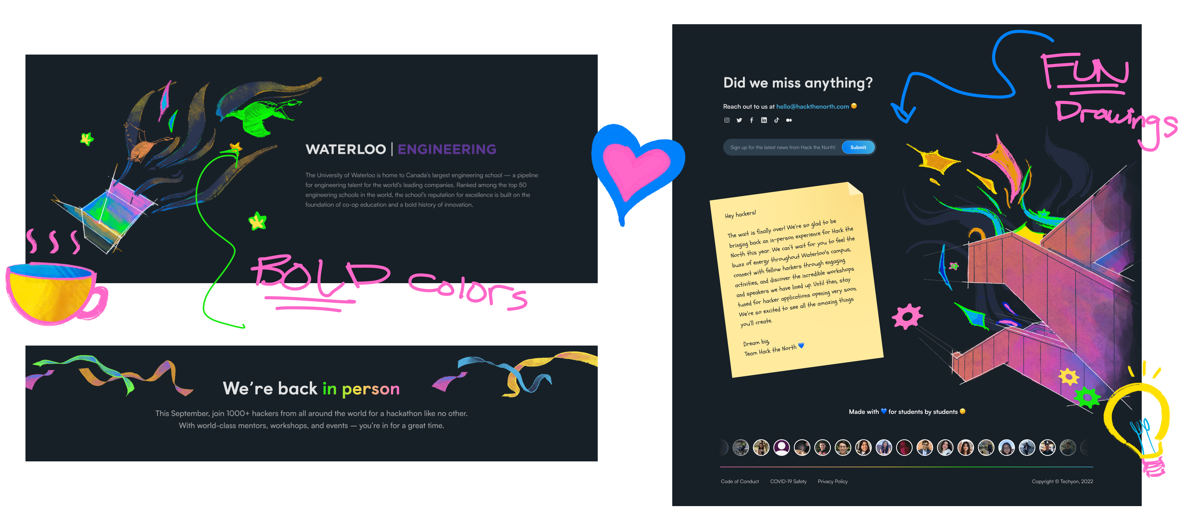
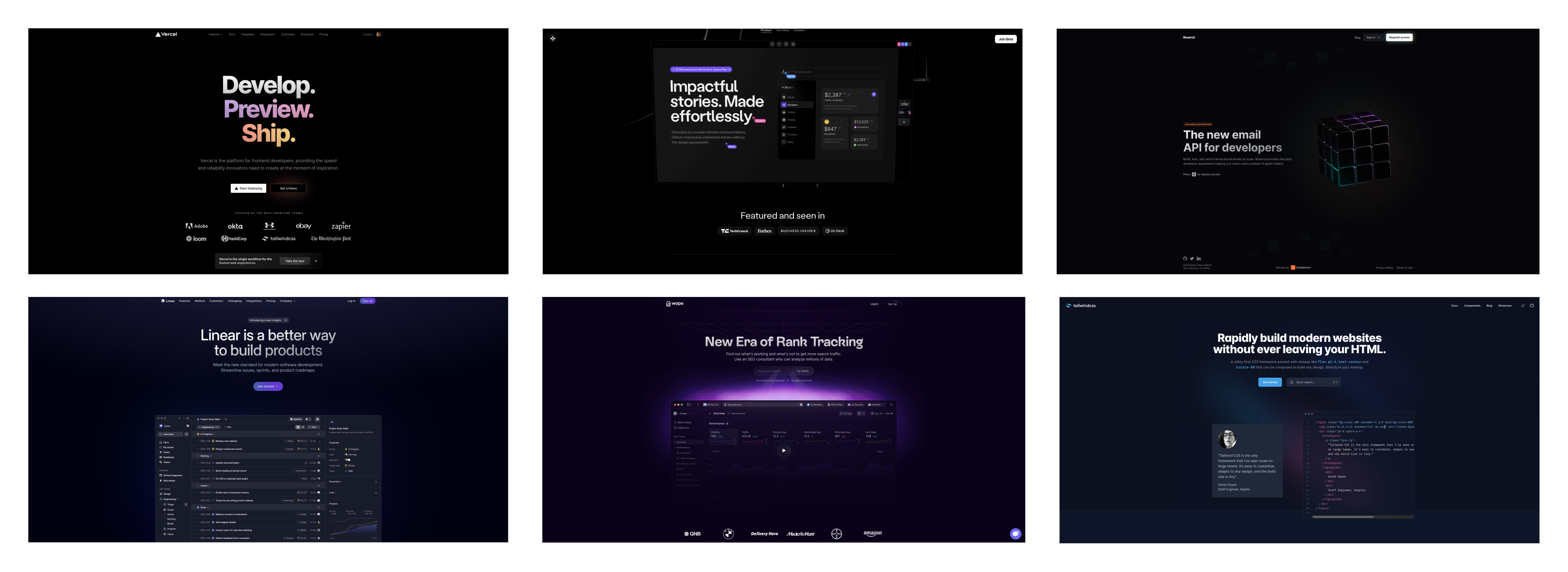 ...and it's hard to not fall into this pattern. To stand out, we created a bright, contrasting color palette and organic illustrations. The playful colors aim to make the website feel more welcoming to those outside of the tech community.
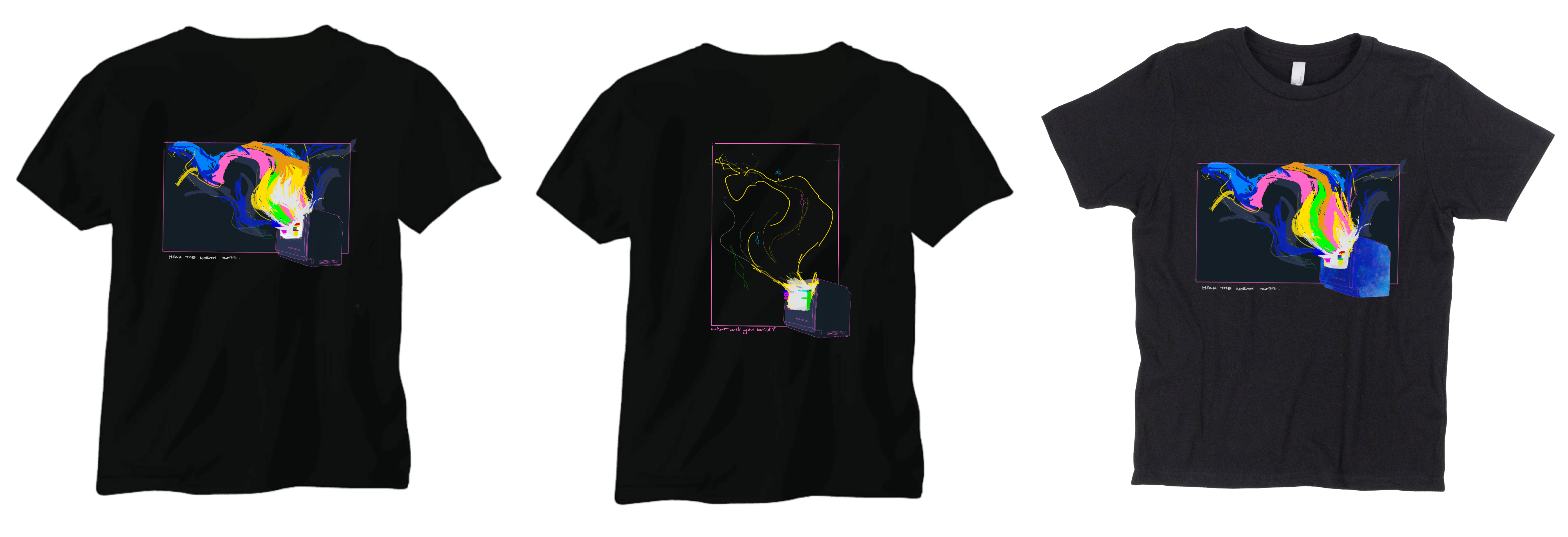
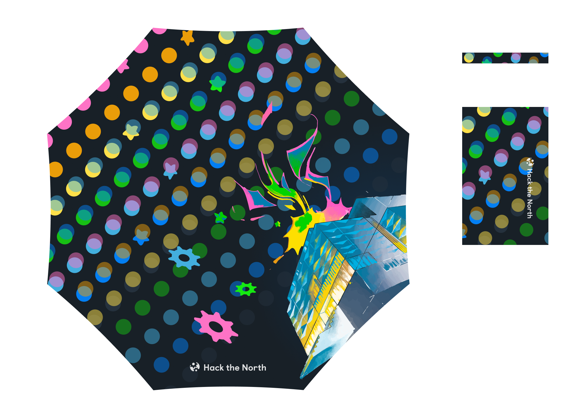
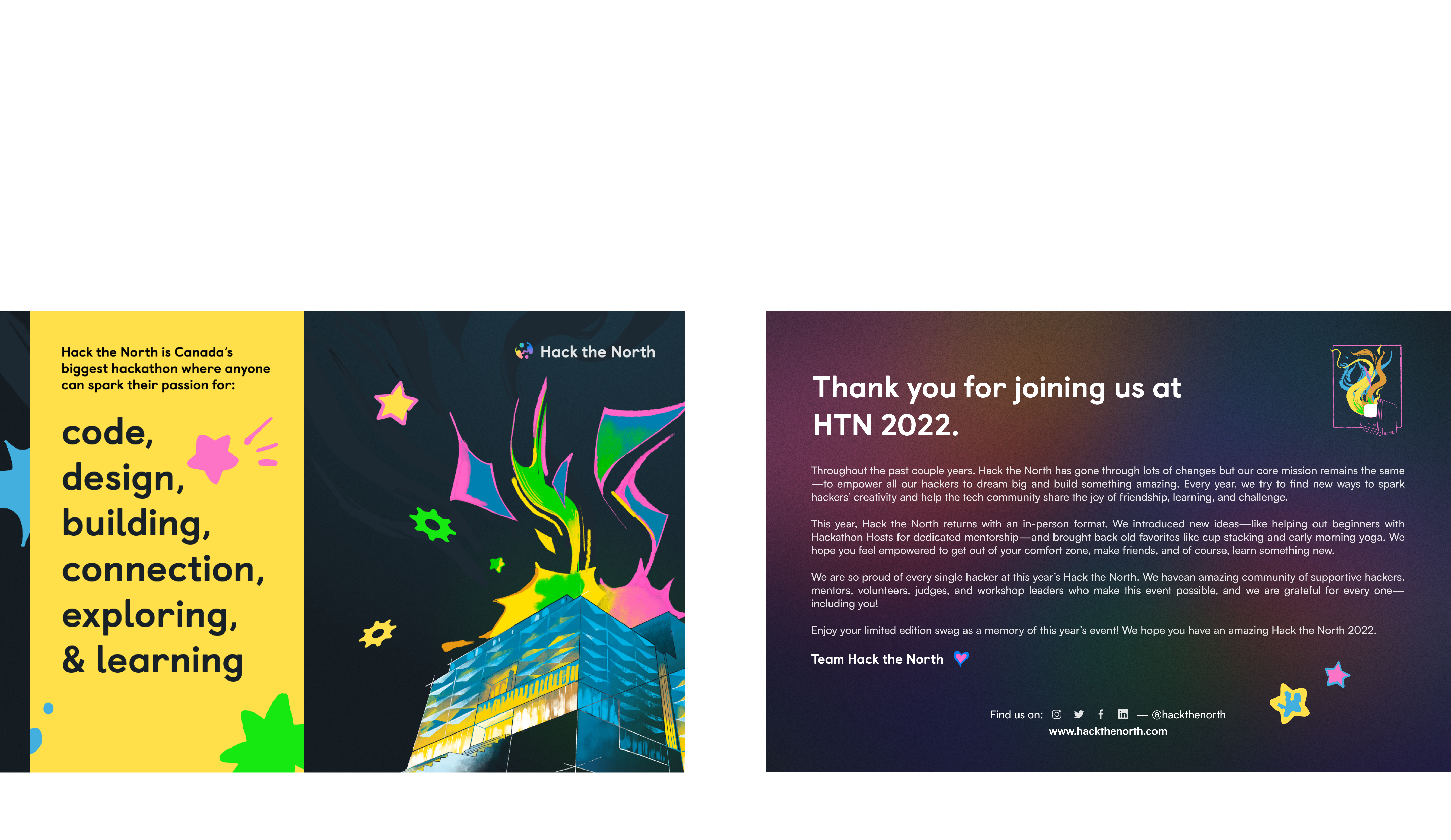
Hackathon swag 🧰
Being back in person meant that we could spend less on shipping, and more on the quality of swag items. This meant the freedom for bolder, larger illustrations with more colors!

Event posters
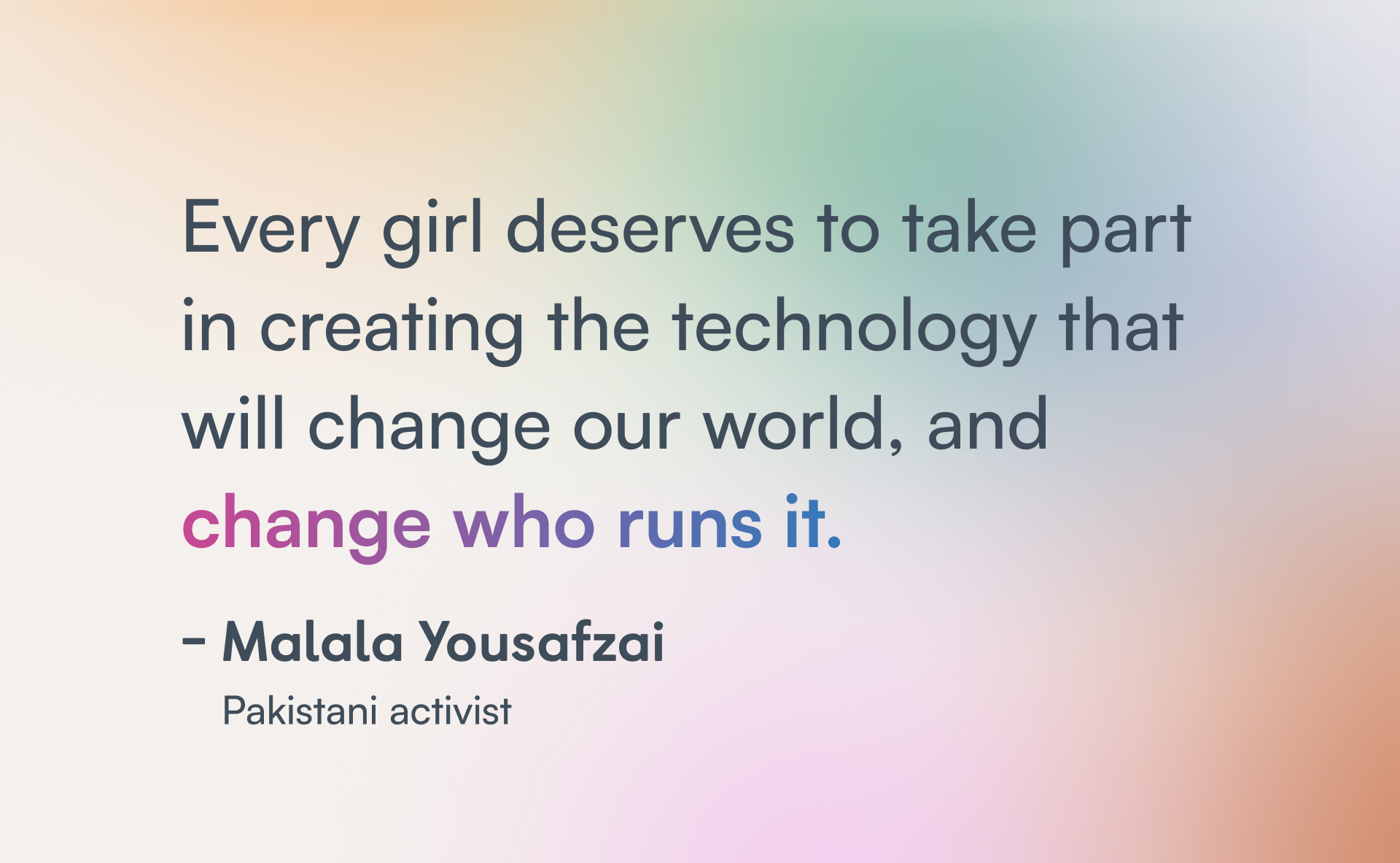
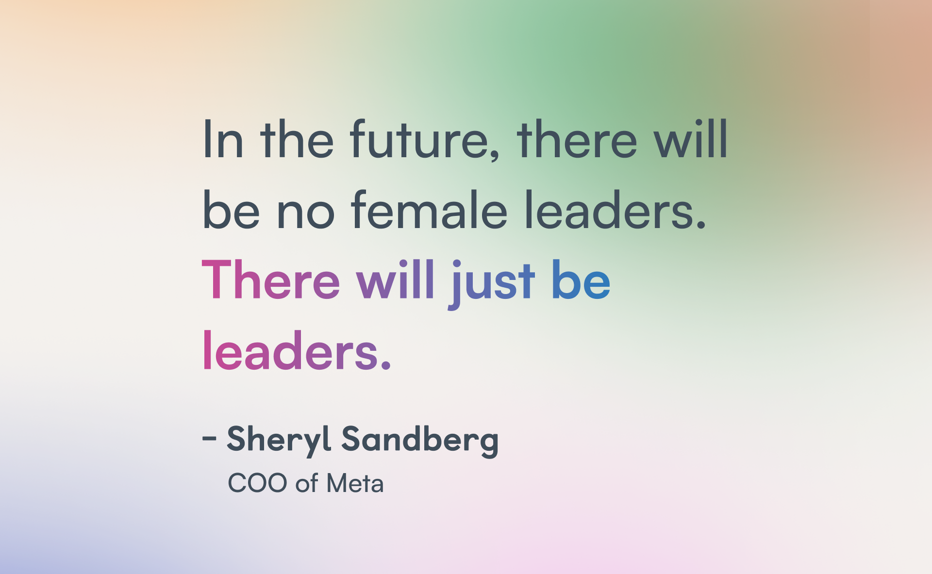
Taking quotes from past leaders in tech, we made empowerment posters to hang around the venue. Font and legibility were a priority since the focus was on the messages. It was also a chance to explore the layer effects and gradients that Figma had to offer!


Social media
HTN has previously used a tiled pattern throughout our social media posts to create one giant, continuous feed. It shows extra attention to detail that many others lack. This year was no different:

Challenges
Overusing assets
With the sheer amount of content I was putting out, it was tempting to just reuse the same set of assets over and over again. As the year went on the brand started to "solidify," and making new content within these confines felt impossible. I could've paced myself better throughout the planning season to avoid creative burnout at the end.
Vectorizing illustrations
A large chunk of our illustrations were created in raster drawing software such as Procreate and Photoshop. If we wanted clean posters and swag prints, this meant we needed to vectorize everything before sending the files off. Those were hours I'll never get back, but now I know how vector image tracing works :D
Print colors
Having never worked with print before, I foolishly designed all these illustrations in the RGB colorspace instead of CYMK. But even after bashing my head for yet another few hours to convert everything, the colors looked dull. It was only after some research that I found out that bright colors — which make up most of our brand, are rendered terribly in print tones. Given a second chance, I'd scale down the use of some of our most neon colors, specifically pink and green.
Conclusion
Hack the North was one of my favourite University experiences so far. You rarely get so much ownership over a project that has an impact on thousands of people. I've also met some of the brightest, most hard-working people who motivate me to this day. Special thanks to:
Rachel, who carried the brand creation on their shoulders and guided me through every stupid design question I had. Thanks for all your patience and trust in me.
Angela, for being an amazing partner graphics designer. Thanks for shouldering the weight of the never-ending social media grind.
Yi Nan, who's always cheered me on and given me feedback. I'll be going through your food recommendation list for years to come.
Kelvin, who's the best photo buddy/UWaterloo hater I could ask for. Your projects and career path inspire me to pursue what I love.

The HTN 2022 organizing team <3